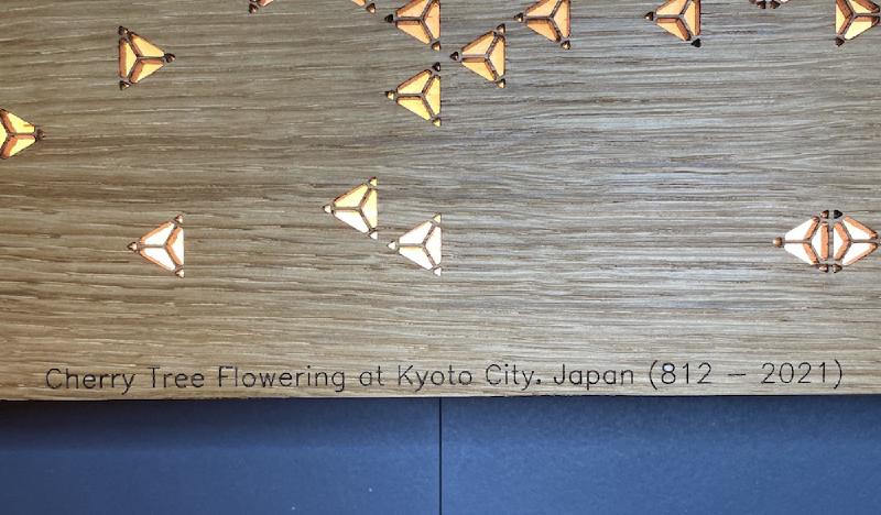

A couple of weeks ago I read that Japan’s cherry blossom experienced it’s ’earliest peak since 812’ and that story lingered in my head ever since.
Some more research lead me to discover that the Osaka University has a really cool dataset available that lists the full flowering date (e.g. the peak) of cherry blossoms and that the data starts from 812 (!!). I downloaded the data and started exploring the variables to conclude that the data needed no complex manipulation but only simple visualization. Look at the story:
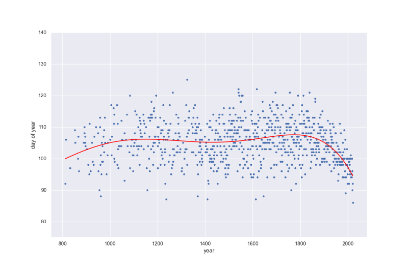
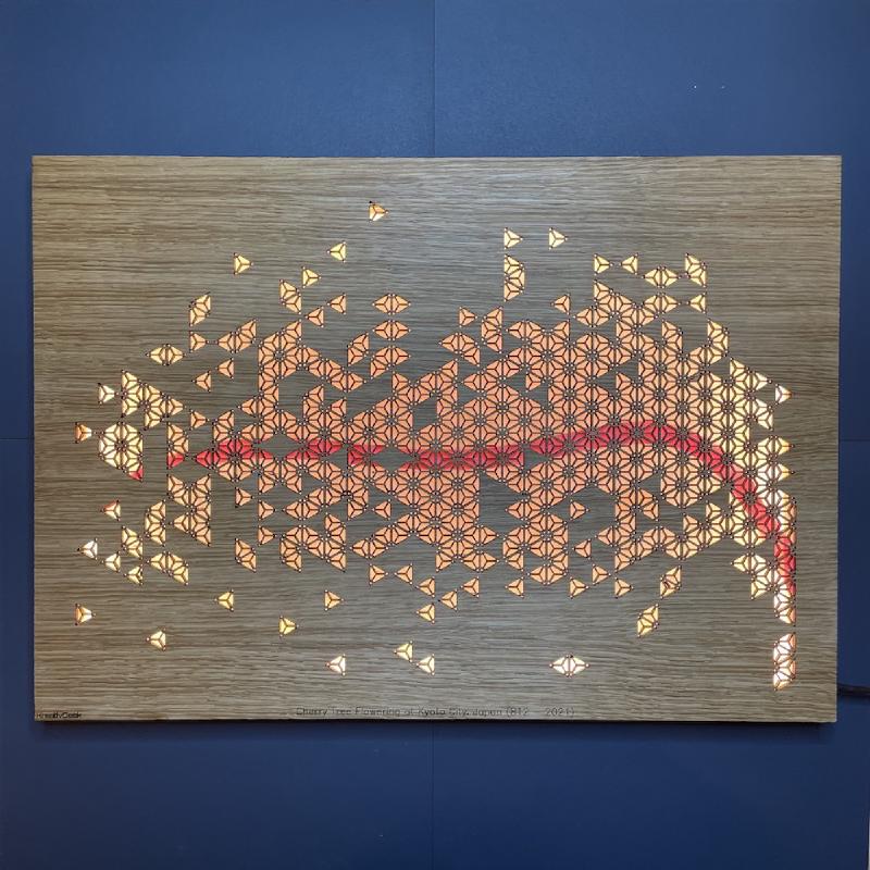
The graph above shows that, for over 1100 years, the peak of cherry blossoms changed from year to year but it stayed stable when viewed over longer periods of time. And then, in the last 50 years, the story takes an abrupt turn. Even without the fitted red line you immediately see that the cherry blossom peaks move closer to the start of the year, year after year. Such a simple visualization and such a strong story.
This story merited a physical presence but I wanted to stay true and change as little as possible. I also wanted to do more than simply print out the graph and be done with it. I needed something with more depth.
And then I remembered Shoji which are the world famous Japanse room dividers. Traditionally these room dividers are assembled from interlocking laths of wood or bamboo which are called kumiko, literally meaning woven.

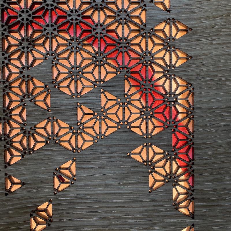
Further research into kumiko revealed that there is a specific pattern Sakura which symbolizes the cherry blossom.
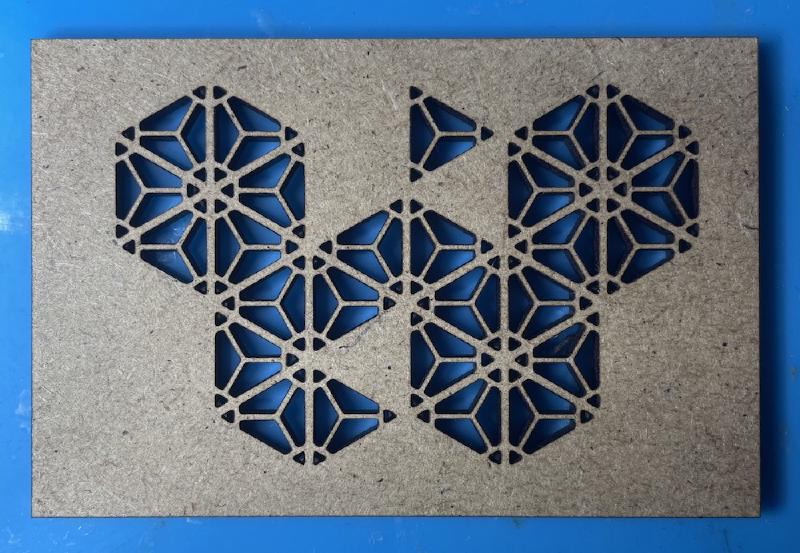
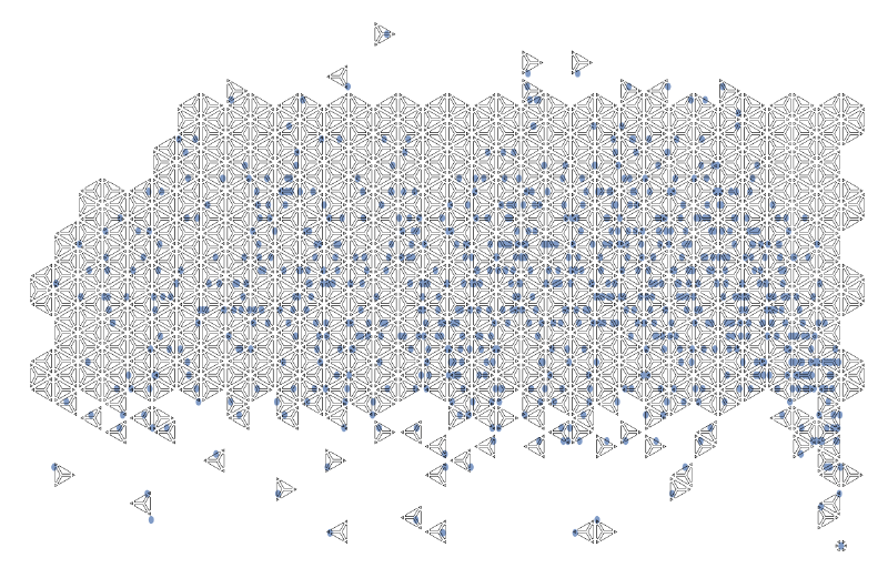
Using Cuttle (really awesome tool!) I created a kumiko sakura pattern and using Affinity Designer I removed all the parts of the pattern which didn’t overlap with the scatter plot. The image below is a screenshot from when I was halfway in the process:
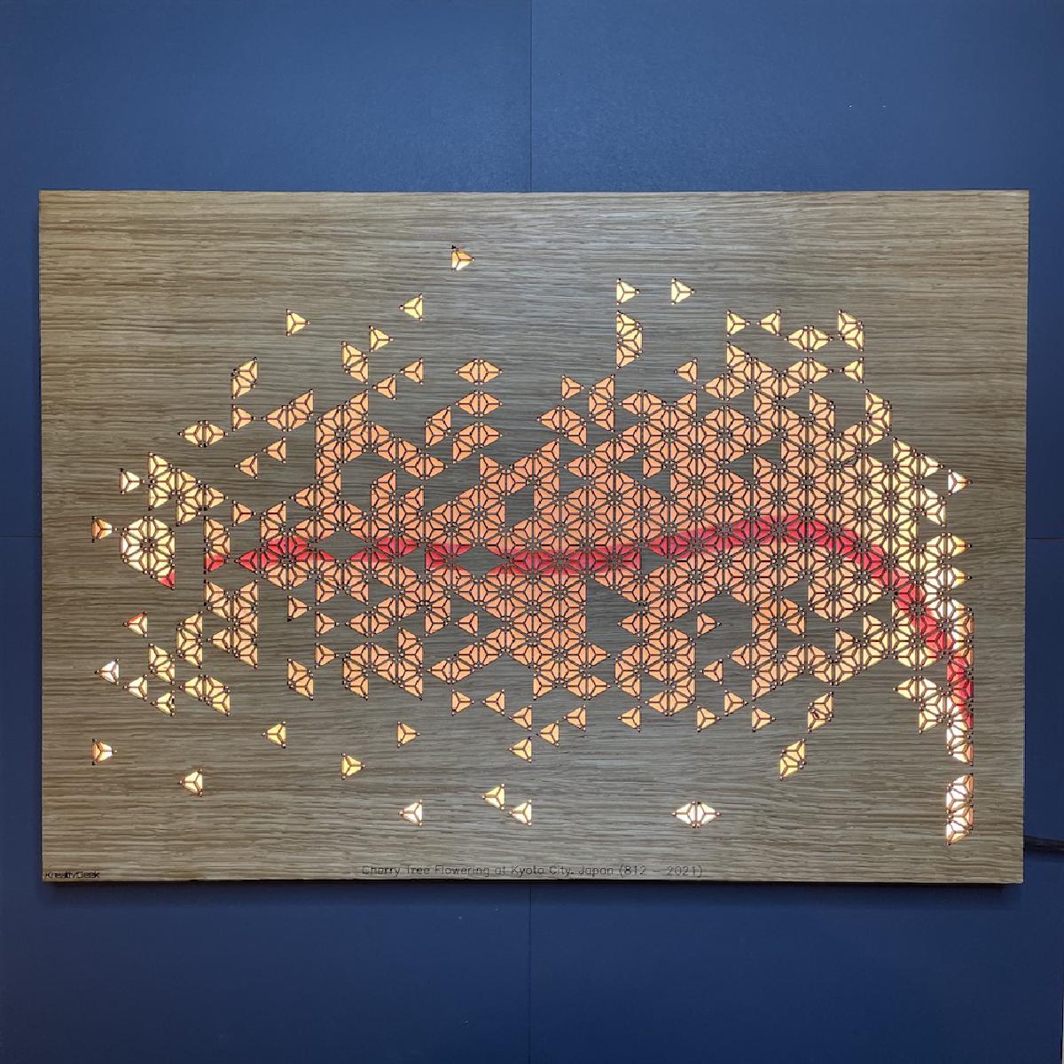
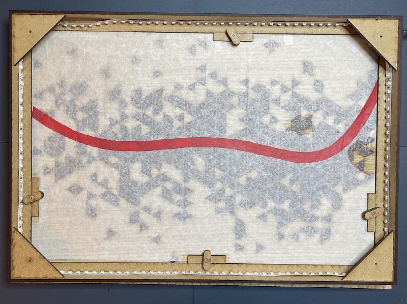
After lasercutting the pattern I taped some translucent paper on the back and to visualize the fitted red line I lasercutted a template and used this to cut out a red line which I also taped on the back. The end result looks like this:
As you can see I also designed a simple light box with LED strips and a mounting system enabling me to explore other visualizations in the future.
I’m really happy with this end result and the that fact the pattern used for the scatter plot symbolizes the cherry blossom is the real cherry on top!
Of course I wouldn’t be able to create this without the awesome people from Osaka University who have published this data, more specifically:
Aono and Saito (2010; International Journal of Biometeorology, 54, 211-219).
Aono and Kazui (2008; International Journal of Climatology, 28, 905-914).
Aono (2012; Chikyu Kankyo (Global Environment), 17, 21-29).